Overview
Native iOS & Android app that controls sleepme's temperature regulation hardware, sleep tracking, and delivers daily insights to help customers sleep.
My Role
My team oversaw all aspects of the app design. We worked with product and engineering to create the best UX possible. We created a design system that would scale as new features are added to the app.
Case Study
To read about how we started from scratch to build an entirely new app, check out the case study below.
View Case Study
Dashboard v1.5
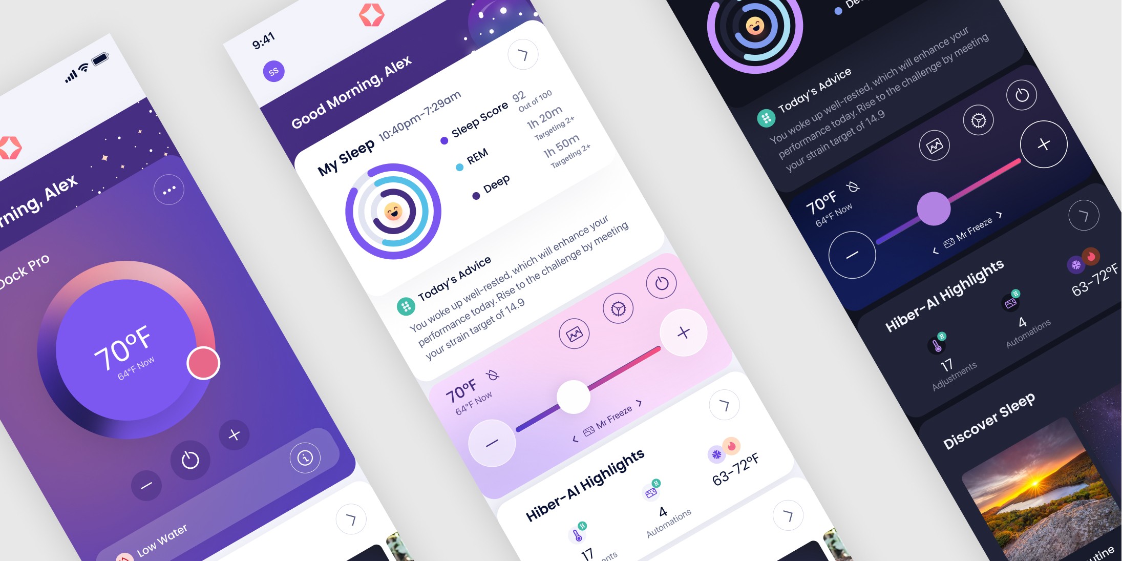
When the app was first launched its sole purpose was to function as a temperature controller for our sleep hardware (similar to a thermostat app). Since that was the only function initially, the decision was made to create a large thermostat dial that consumed most of the dashboard simply so the app wouldn't look empty while we worked behind the scenes to build out other features
The Issue
Over time we added sleep tracking data, soundscapes, multimedia content, and various other features, each of which required representation on the dashboard. Also, our business requirements changed during that time. The decision was made to focus less on temperature control, and more on sleep tracking along with our subscription plan, which we called "Hiber-AI". So I was tasked to redesign the dashboard as well as some secondary pages to make them better suited for our new features.
Dashboard V2
The solution we came up with was to condense the sleep data card and position it at the top of the page. After that, we needed to condense the size of the thermostat control component.
Lastly, our new CEO wanted the UI to be dark mode first, light mode second (the opposite of our former CEO's preference), so I tweaked our design system with that in mind. I created this design to solve our issues.


