Overview
Prior to my arrival, Jenius Bank purchased a white labeled design system to use for their native app and website. This design system was underwhelming, so they wanted to do a ground-up redesign and create their own design system.
My Role
I was hired as the staff-level design specialist to lead the design of the mobile platform, which would in-turn be adapted for use on the web. I initially started out working on purely aspirational design mocks to gauge likes/dislikes, then worked with the research team to perform user preference tests to help decide on the overall direction, then worked with key stakeholders to establish new design patterns and flows, then finally built out complete design systems in Figma for both iOS & Android.
Why are we doing this?
The previous design system Jenius used was a web-based kit that was adapted for native mobile use. While this did technically work, many native components and patterns were ignored, causing a less than optimal user experience. Also, there was no dark mode mapping in the design color system. Lastly, many believed the original UI style felt dated, and not as elegant as it needed to be for a digital-only bank.
1. Concepts
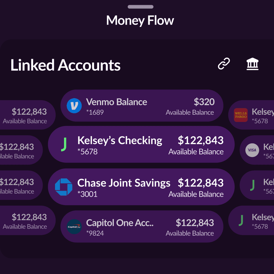
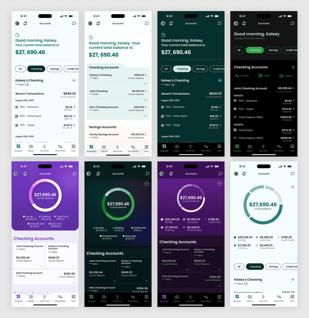
To kick off the project I first wanted to build out aspirational UI examples so stakeholders could see for themselves the numerous directions we could go. I find this is also a fun way to kick off a project and get people excited before seeing abstract wireframes that they may or may not fully be able to visualize.
2. Preference Testing
After creating dozens of aspirational designs, we wanted to gauge user feedback on some of the stronger designs, so after internally deciding on a few design directions, we preference tested the options with select customers.
3. Navigation Patterns & Flows
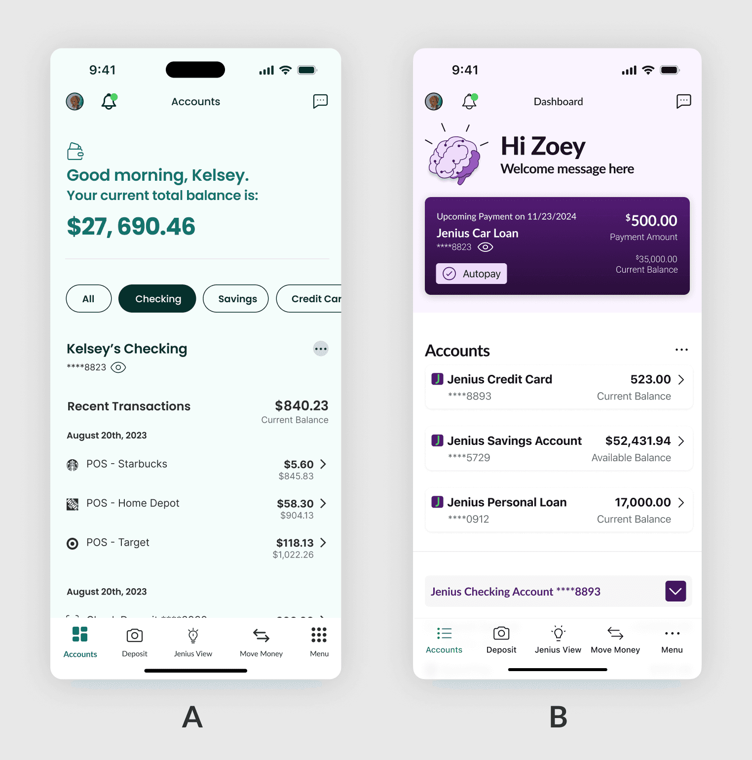
After determining a visual direction to go in, it was time to get to work on actually defining how users will interact with it with the app, and decide which features and services would be most prominent in the app. Working with a small team of stakeholders, I established core nav patterns and principals that will be used throughout and created a fully interactive prototype to test with.
4. Color System
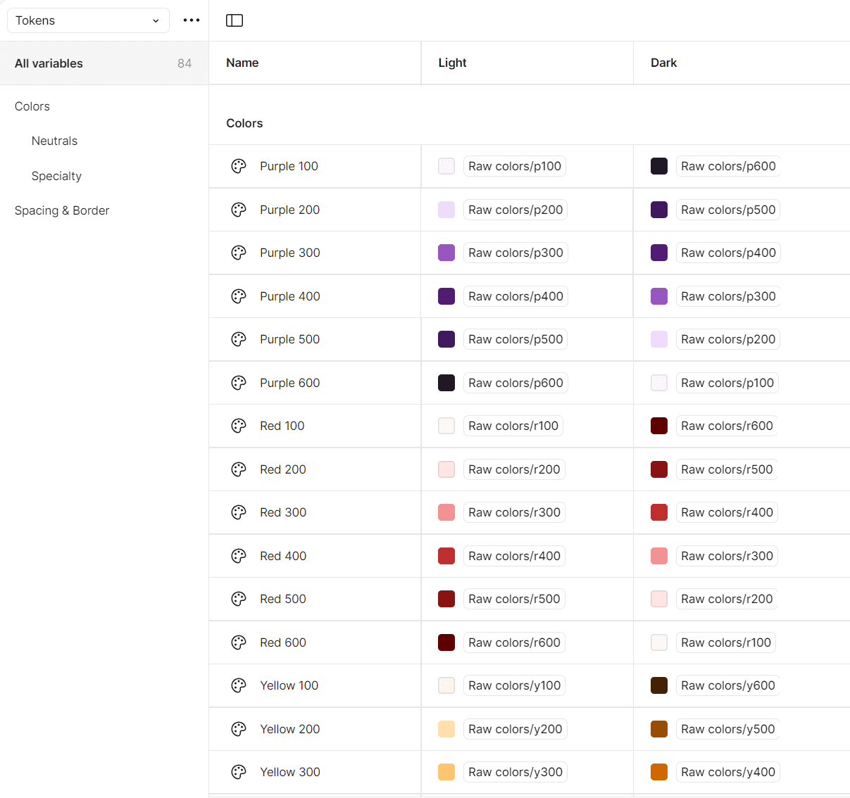
One of the biggest issues with the previous design system was its color system. The mappings were not set up in a way as to where the colors could logically scale across all components, so Devs ended up hard coding colors in ways that varied from component to component. With the new system I created mappings for both light and dark modes using Figma tokens. We created one color palette that could be shared between iOS & Web, and a second for Android with mappings specific to Material 3.
5. Figma Components
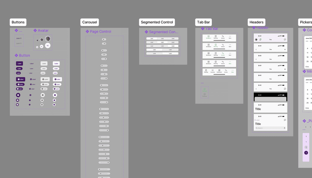
Finally, it was time to build out the actual components needed in Figma, as well as defining typescale, color mapping for both light and dark modes. We decided to use an atomic design approach. Which meant first building out atoms, molecules, and organisms for both iOS, Android, as well as a shared component library for all platforms.
